
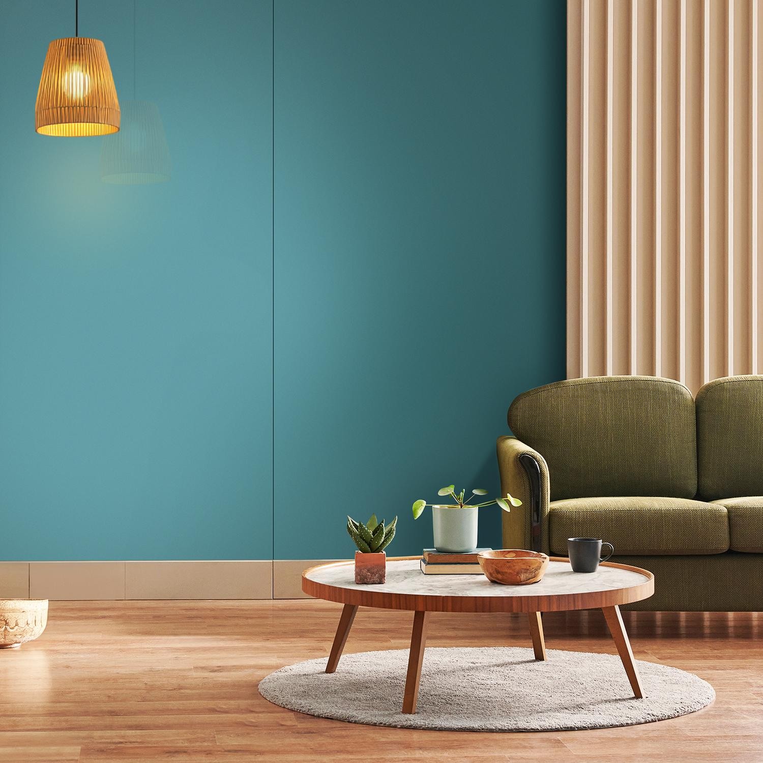
There are colours that follow trends, and then there are colours that quietly outlast them all. Blue belongs to the latter. From soft, airy tones to deeper, more structured shades, blue offers a range that adapts effortlessly to different spaces. It reflects light, introduces calmness, and builds a sense of clarity without overwhelming the room. Yet, what elevates the appeal of blue is when it works as part of a dual-tone wall design. Pairing blue laminates with complementary colours helps create depth, contrast, and visual interest within the bedroom. In this article, we’ll explore 15 blue wall colour combinations in wall laminates, sharing ideas you can replicate in your bedroom.
Why Blue Works in Modern Bedrooms
Every well-designed bedroom begins with a colour that understands space. Blue does exactly that. Lighter shades such as light blue and sky blue reflect natural light, making rooms feel more open. Deeper tones like navy and electric blue introduce structure and contrast. Brighter options, on the other hand, add energy, while muted tones bring a more grounded, contemporary feel.
The Many Shades of Blue Laminates: Building a Palette, Not Just a Wall
Within Greenlam’s collection, blue laminates exists across a wide spectrum, each shade offering a distinct visual character and design direction:
- Sky Blue: A light, slightly greenish-grey cool tone that feels calm, balanced, and contemporary
- Blue: A classic mid-tone blue that sits neutrally within the palette, making it easy to pair across styles
- Light Blue: A softer, brighter blue with a subtle warmth, ideal for open and inviting spaces
- Electric Blue: A muted, slightly greyed blue that introduces a more refined, modern edge
- Celestial Blue: A brighter, clearer blue that adds energy without feeling overwhelming
- Robin Blue: A vivid, slightly purplish blue that brings a more expressive and playful dimension
- Navy Blue: A deep shade that anchors the palette and adds contrast
- Blue Galaxy: A greenish, muted blue that feels grounded and slightly earthy
- Zephyr Blue: A soft, grey-infused blue that feels neutral and understated, ideal for creating calm, balanced palettes.
These variations in blue laminates allow you to build layered blue wall colour combinations that feel cohesive, whether you are working with lighter, reflective tones or deeper, more defined contrasts.
What strengthens this palette further is the finish. At Greenlam Laminates, we offer a variety of finishes to help you create a layered ambience with the colour blue. For instance, our HD Gloss finish enhances clarity, suede deepens tone, and textured finishes such as Barrel, Aria, and Trace introduce movement, ensuring that even a single colour never feels flat.
Also Read: Old vs. New: The Shift from Traditional Wall Designs to Modern Wall Laminates
Blue Bedroom Wall Colour Combinations
To help you get started, we’ve compiled a curated list of two-tone colour combinations with blue laminates. These pairings offer clear direction on how to use blue across different moods and styles, making it easier to choose what works for your bedroom.
Blue + White (Wool, Ivory, Snow White, Absolute White, Statuario)
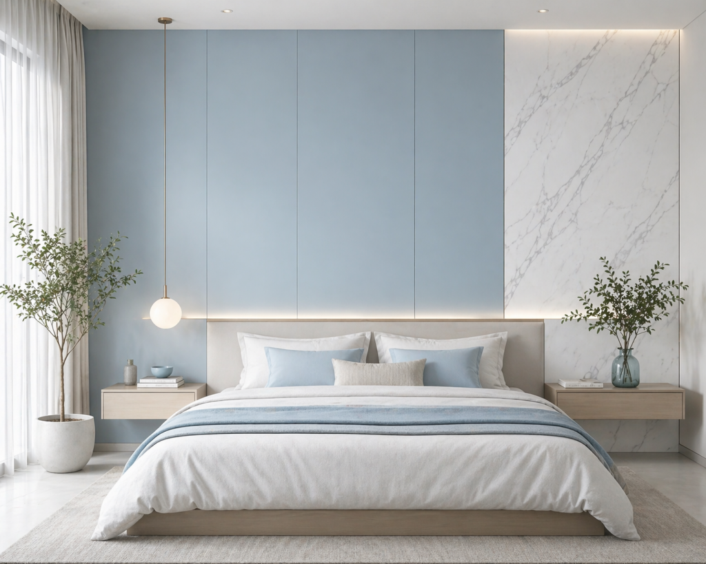
For this combination, Light Blue, Sky Blue, or Celestial Blue work best. These lighter tones keep the palette open and breathable, while whites enhance clarity and brightness. Warmer white laminates such as Wool and Ivory soften the cool undertone, while Snow White and Absolute White create a sharper, cleaner contrast. Statuario (a white marble-inspired laminate with soft grey veining) adds a more refined, surface-led variation to the palette.
Why it works: The variation within whites prevents flatness while maintaining a clean, cohesive palette.
Blue + Light Browns (Inspired by Rising Beech, Silver Maple, Oak, Cherry)
Light brown, wood-inspired laminates bring in subtle warmth through grain rather than colour contrast. This pairing works best with Sky Blue, Light Blue, or Blue Galaxy. Sky Blue and Light Blue laminates keep the palette soft and airy, while Blue Galaxy, with its muted, slightly green undertone, connects naturally with wood grains.
Why it works: Natural brown and wood-inspired textures introduce warmth and break the smoothness of blue surfaces without creating strong contrast.
Blue + Beige (Soft Beige, Oatmeal, Tidal Sand, and Earthy Elite)
Neutral browns such as Beige, darker Oatmeal, and Tidal Sand (a grey-infused light brown) create a seamless transition between cool and warm tones. Use Electric Blue, Blue Galaxy, or Sky Blue for this palette. Zephyr Blue (a greyish blue) also works well to build a more neutral, balanced look. Introducing Earthy Elite (a light brown, mesh-inspired textured laminate) adds subtle surface depth while staying within the same tonal family.
Why it works: These tones introduce warmth without shifting the palette too far into contrast.
Blue + Grey (Silver Grey, Smog, Chicago Steel)
Grey laminates such as Silver Grey and Smog from the Jupiter range, along with Chicago Steel (a metallic-inspired grey laminate), build a refined, contemporary palette. This combination works best with Electric Blue, Blue, or Navy Blue. Electric Blue aligns seamlessly with greys due to its muted base, while Navy adds depth and contrast.
Why it works: Instead of contrast, this pairing creates depth through tonal layering, keeping the look cohesive.
Finish suggestion: Satin or Aria finishes for a smooth, matte-modern appearance.
Blue + Muted Greens (Sea Green, Olive, Leaf Green, Dark Green)
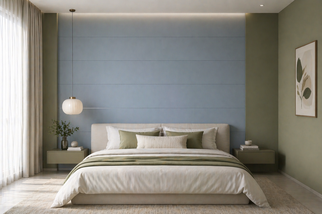
Green laminates extend the blue palette naturally. Sea Green keeps the look light, Olive adds earthiness, while darker greens introduce depth. Blue Galaxy and Zephyr Blue are perfect for creating an earthy appeal.
Why it works: Blue and green sit adjacent on the spectrum, allowing for seamless blending.
Sky Blue + Deeper Blues (Layered Blue Tones)
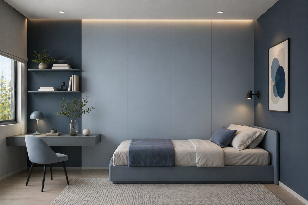
This is where the full palette comes together. Combine Light Blue or Sky Blue as the base, with Electric Blue or Blue for layering, and Navy Blue for depth. Accents of Celestial Blue or Robin Blue can add brightness where needed.
Why it works: Tone-on-tone layering enhances visual depth without breaking harmony.
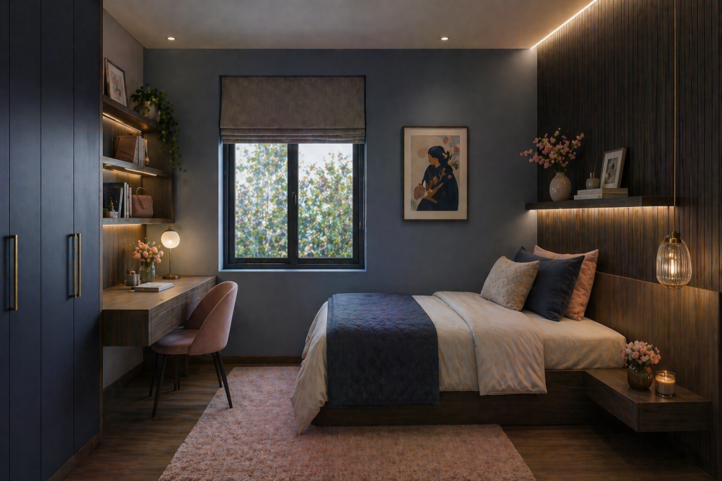
Darker and medium brown, wood-inspired laminates introduce richness and structure. This pairing works best with Navy Blue, Electric Blue, or Blue Galaxy. American Walnut and Texas Rodeo create depth, while Lorraine and Saturno Walnut offer balanced mid-tones.
Why it works: These tones ground the coolness of blue without overpowering it.
Finish suggestion: Barrel or Trace realistic wood-inspired finishes enhance the natural grain and depth.
For the brown laminates collection – Click here
Blue + Terracotta/Mud Ash
Earthy tones such as Terracotta and Mud Ash introduce warmth that feels grounded and architectural. Use Blue Galaxy, Electric Blue, or Sky Blue for this combination. Blue Galaxy and Electric Blue pair especially well with earthy tones due to their muted base.
Why it works: The muted nature of these shades avoids sharp contrast while adding visual interest.
Blue + Mustard
Best paired with Sky Blue, Light Blue, or Electric Blue. Lighter blues keep the palette soft, while Electric Blue adds a slightly more contemporary edge.
Why it works: Muted mustard introduces warmth without overpowering the blue base.
Important nuance: Avoid bright yellows; keep the tone dusty and subdued.
Blue + Cream Yellow
Use Light Blue, Sky Blue, or Celestial Blue. These brighter, lighter blues maintain softness while allowing yellow to add subtle contrast.
Why it works: Yellow complements blue, but softened tones keep the palette refined.
Avoid: Neon or lemon yellows.
For the yellow laminates collection – Click here
Blue + Burnt Orange/Rust
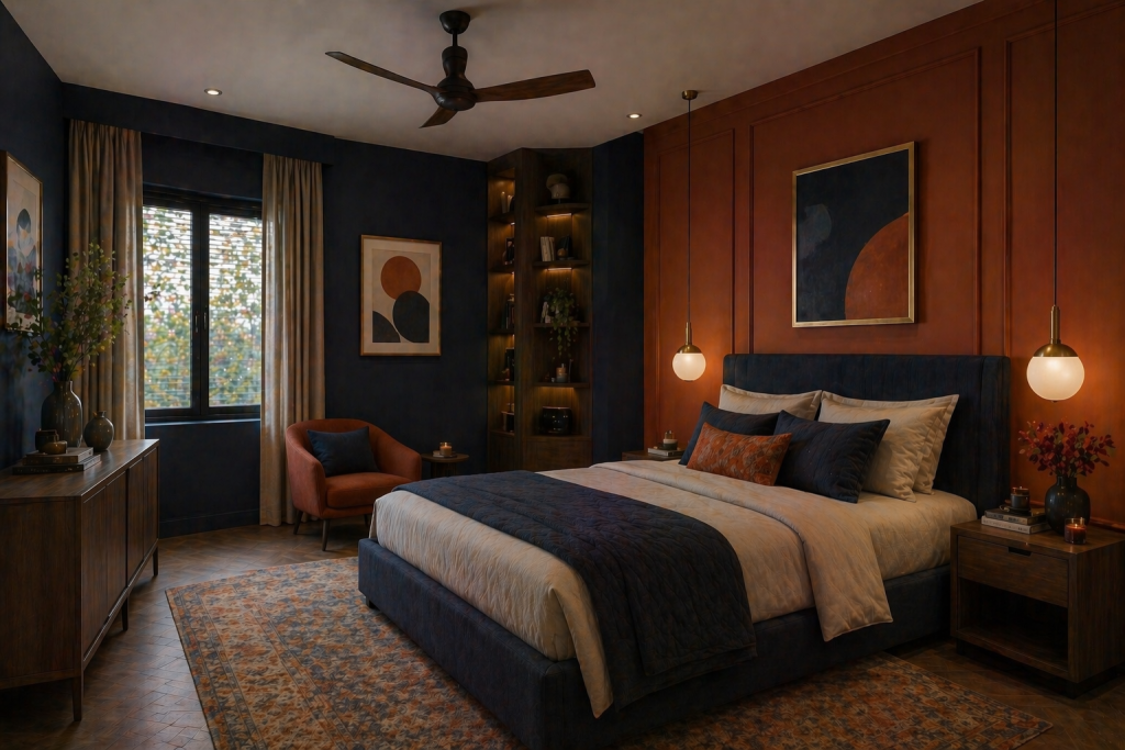
Deeper blues hold their own against earthy orange tones, preventing the palette from feeling washed out. These tones introduce depth and warmth in a controlled, design-forward way.
Why it works: Muted pigments soften contrast, creating a balanced and layered composition.
Design insight: This palette feels more boutique and architectural than decorative.
For the orange laminates collection – Click here
Blue + Deep Neutrals (Charcoal, Black, Dark Cherry)
Deep tones such as Charcoal, Black, and Dark Cherry (inspired by woodgrains), along with Black Marmor (a marble-inspired black with subtle light veining), introduce sharp contrast and visual definition against blue. Use Navy Blue, Electric Blue, or Blue for a darker, more cohesive palette, or lighter blues for a more pronounced contrast. These are not base colours; they work best as framing and accent elements within the design.
Why it works: The depth of these shades anchors the softness of sky blue, creating structure without overwhelming the space.
Blue + Gold and Copper (Gold Foil, Copper Foil)
Gold and Copper tones introduce warmth and reflectivity into the cool palette. While the finish may be metallic, the impact is primarily colour-driven, warm highlights against a cool base. Best paired with Navy Blue, Electric Blue, or Celestial Blue. Navy creates a rich, premium contrast, while Celestial Blue offers a more vibrant, modern pairing.
Why it works: These tones sit within the warm spectrum (close to muted yellows and earthy oranges), allowing them to complement blue without clashing.
Blue + Soft Pinks (Almond Pink, Heather, Light Pink)
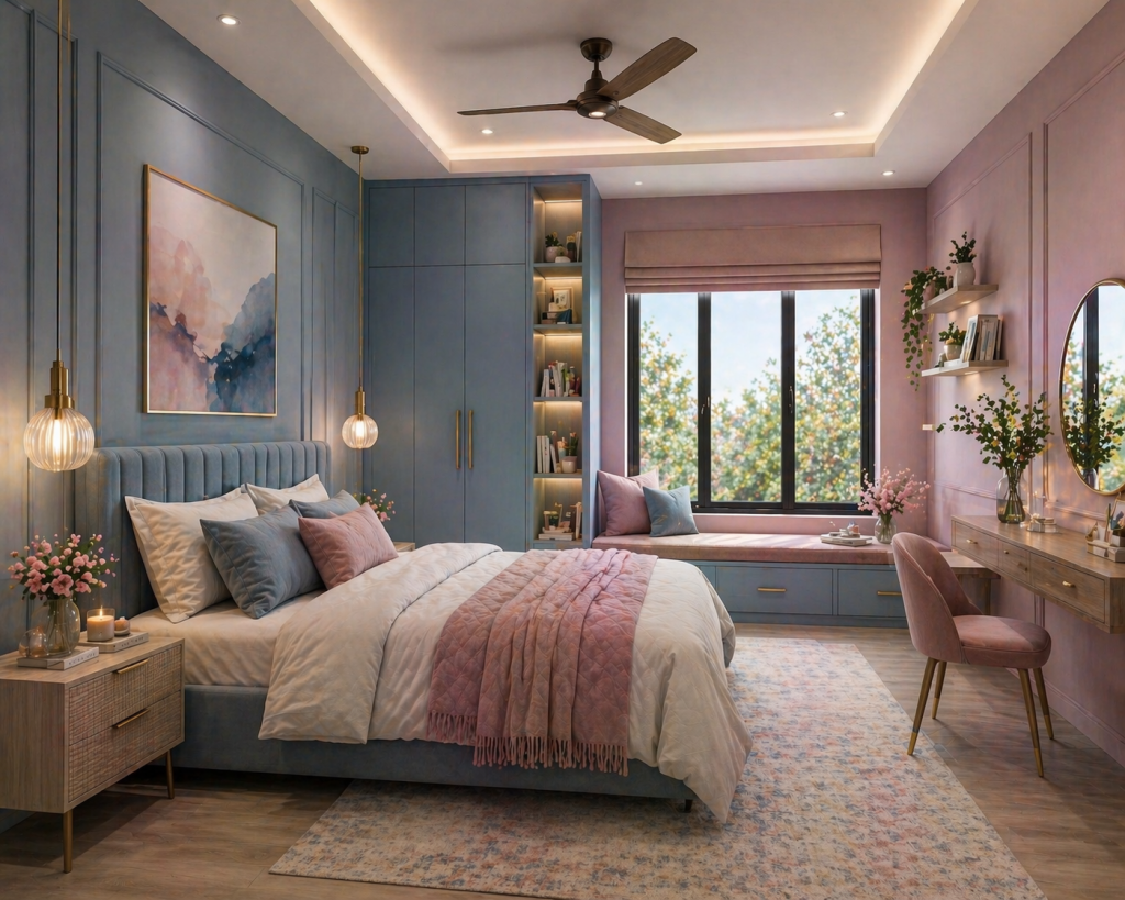
Pair blue with Almond Pink, Heather, or Light Pink to create a soft, balanced bedroom palette. Lighter shades like Sky Blue or Light Blue keep the space airy, while Electric Blue adds a slightly modern touch. This combination feels calm yet gently expressive, without becoming overly decorative.
Why it works: The warmth of pink tones softens blue’s coolness, creating a harmonious and layered look.
For the pink laminates collection – Click here
Blue + Brick Red
Combine blue with Brick Red for a deeper, more grounded contrast. Navy Blue or Blue Galaxy work best here, adding structure and richness to the space. This pairing is ideal for accent walls or bed-back panels where you want a more defined visual impact.
Why it works: The earthy warmth of brick red balances the depth of blue, resulting in a bold yet controlled palette.
For the red laminates collection – click here
The Role of Finish: Where Colour Comes Alive
Finish is where colour reveals its true character. The same sky blue laminate can appear soft, sharp, muted, or vibrant, depending entirely on how the surface interacts with light and touch.
Greenlam Laminates offers a wide spectrum of finishes that allow you to shape this experience with precision. From HD Gloss and Super Gloss laminates that reflect light and enhance brightness, to Suede finishes and Satin Finishes that soften the surface and diffuse light, each option defines how colour is perceived within the space.
Why finish matters:
- It adds a tactile layer to the design
- It prevents colour from appearing flat or one-dimensional
- It influences how light moves across surfaces throughout the day
Beyond sheen levels, Greenlam extends this versatility through specialised surface textures that bring material expression into the palette:
- Wood-Inspired Textures (Barrel, Aria, Veracious Bark, Chiselled Wood): Enhance grain realism, adding depth and a more natural, tactile feel
- Stone-Based Surfaces (Jupiter, Tiles, Terra): Bring a structured, architectural quality with mineral-like textures
- Textile-Inspired Finishes (Nappa Leather, Tex Mex): Add softness and visual richness, creating a more layered, upholstered effect
In practice, this means a sky blue laminate paired with the same colour palette can feel entirely different: a Satin finish may appear calm and refined, while a textured or suede surface introduces depth and tactility.
Designing with Scale: Full Wall, Half Wall & Accent Panels
The impact of a colour combination is not just defined by the palette; it is shaped by how it is applied across surfaces. Whether you choose a full wall, a half-height treatment, or a focused accent, scale plays a critical role in how blue laminates appear.
Full Wall Applications
For larger bedrooms or minimal interiors, full wall panelling creates a seamless and immersive look. This is where Greenlam’s 4×10 laminate collection becomes especially relevant. The larger format reduces visible joints, allowing the colour and texture to flow uninterrupted across the surface.
Best suited for: Master bedrooms, feature walls behind beds, and spaces where continuity is key.
Half Wall & Layered Panels
Half-height wall treatments introduce structure without overwhelming the room. Pairing blue laminates with neutrals or woodgrains in a split format creates a balanced, layered composition.
Best suited for: Compact bedrooms, transitional interiors, and spaces where subtle contrast is preferred.
Accent Walls & Panel Highlights
Accent walls allow you to experiment with contrast, texture, and pattern without dominating the space. This is where tactile surfaces add depth to the design.
The Lexus collection by Greenlam, featuring finishes such as Shore, Echoe, and Strands, introduces linear, 3D-inspired textures that respond dynamically to light and movement.
Why it works: These surfaces shift visually through the day, adding dimension even within a single colour palette.
Best suited for: Bed-back panels, niche highlights, and statement sections within the room.
Making the Right Choice, Made Simpler
Design decisions often involve multiple variables: colour, finish, texture, and material. What simplifies this process is access to the right tools that allow you to visualise, compare, and refine your choices with clarity.
Whether you are looking for blue laminates or any other colours, Greenlam Laminates brings together a set of thoughtfully designed resources to make this journey more intuitive:
Flipbooks: Curated Design Inspiration
Greenlam’s flipbooks present a stylised spread of real-world applications, helping you understand how colours, finishes, and textures come together in spaces. Rather than just isolated swatches, these curated visual references offer a complete design perspective, making it easier to imagine how sky blue combinations translate into finished interiors.
New Arrivals & Specialised Catalogues
Dedicated catalogues showcase the latest laminate designs, finishes, and surface innovations. Whether you are exploring new textures, updated colour palettes, or material-led collections, these catalogues help you stay aligned with current design directions while narrowing down your choices efficiently.
Colourama App: Design, Visualised Instantly
The Colourama app, our mobile application, simplifies laminate selection by turning inspiration into a workable palette.
- Simply download and sign up for the app
- Choose a colour from Greenlam’s defined palette, or
- Click a picture of your inspiration
The app will:
- Match it to the closest Greenlam laminates
- Suggest complementary laminates to complete the combination
This allows you to move from idea to execution with greater confidence, especially when working with layered palettes like sky blue.
Together, these tools ensure that choosing the right laminate is no longer based on guesswork. You can explore combinations, test ideas, and refine your palette before making a final decision, bringing both clarity and control to the design process.
Also Read: Six Ways Laminates Can Give Your Bedroom a Modern Makeover
About Greenlam Laminates
As one of the world’s leading laminate manufacturers, Greenlam Laminates offers a wide range of options designed to balance aesthetics with performance. From versatile blue shades to varied finishes and textures, our collection allows you to create spaces that reflect your design intent with precision.
Backed by advanced manufacturing and a strong focus on quality, our laminates are crafted to deliver durability along with refined surface appeal. With an extensive network of dealers and distributors, accessing the right solution for your project remains seamless.
To explore our full range of laminates, finishes, and design tools, connect with us today. Call us at 1800-833-0004, email at info@greenlam.com, or visit our contact form for personalised assistance.
Frequently Asked Questions
What are the advantages of using decorative laminates for bedroom walls?
Decorative laminates provide design flexibility through colours, finishes, and textures. They are easy to maintain, long-lasting, and help create more defined and structured wall designs.
What is the best bedroom wall colour combination with blue?
Blue works well with whites, greys, wood tones, and muted earthy shades. Lighter blues create a calm, open feel, while deeper blues pair well with contrast colours for a more structured look.
Which sky blue colour combination works best for bedroom walls?
Sky blue pairs effectively with ivory, beige, light wood finishes, and soft greys. These combinations maintain brightness while adding subtle warmth and depth to the space.
How can I create a modern sky blue wall design colour combination using laminates?
Use sky blue laminates as a base and combine them with neutral or textured panels in a dual-tone format. Adding finishes like satin or suede helps enhance depth and gives the wall a more refined appearance.
Which colours match well with sky blue bedroom walls?
Sky blue matching colours include white, beige, grey, light wood tones, and muted greens. These combinations help balance the cool undertone while keeping the room calm and cohesive.
Are light blue bedroom walls suitable for small spaces?
Yes, light blue bedroom walls with laminates reflect light well and create a sense of openness. When paired with minimal contrasts, they make smaller rooms feel larger and less cluttered.
How do designer laminates enhance blue wall colour combinations?
Designer laminates, such as those from Greenlam Laminates, offer solid colour payoff and add depth through finishes and textures, making blue wall colour combinations more dynamic. They also ensure consistency in colour and allow for seamless panel designs.